The Guggenheim: Frank Lloyd Wright
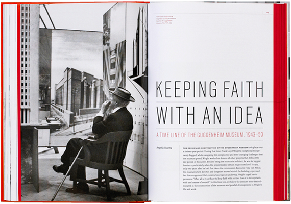
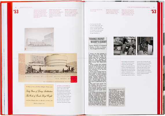
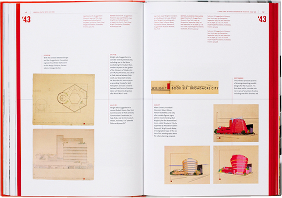
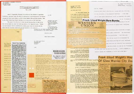
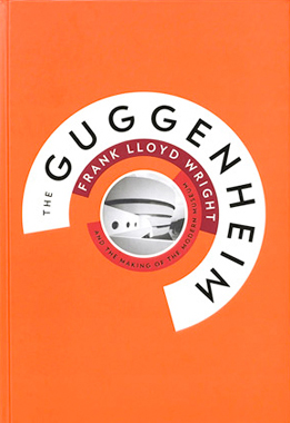
The Guggenheim: Frank Lloyd Wright and the Making of the Modern Museum is the definitive chronicle of the creation of the iconic building, the final project of its renowned architect. Designed by Abbott Miller, who has a long-standing relationship with the museum, the book has been published to commemorate the Guggenheim’s 50th anniversary and is a companion volume to Frank Lloyd Wright: From Within Outward, the blockbuster exhibition that became the museum’s most popular show ever during its run in New York this summer. Miller describes the project as the ultimate souvenir book, and it has been designed to captivate architectural aficionados and casual visitors alike.
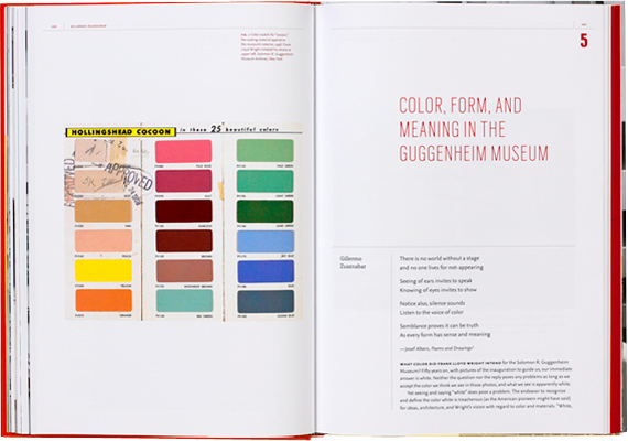
Miller has worked with the Guggenheim Museum for nearly fifteen years, collaborating on their publications, website, and exhibition graphics, and the design of the identity for the Guggenheim Foundation. When working on a magazine project for the Guggenheim in 1996, Miller commissioned Jonathan Hoefler to develop a typeface based on the lettering found on the façade of the Frank Lloyd Wright building. “Guggenheim”-now "Verlag”-is now a central ingredient in the museum’s communications program. The font serves as the display font throughout the book, supported by body copy and captions set in Martin Majoor's beautiful font Nexus.
The design translates the famous Guggenheim spiral into an iconic typographic composition, its concentric circles evoking the view from the top of the rotunda.
[whereever]: an out of place travel journal
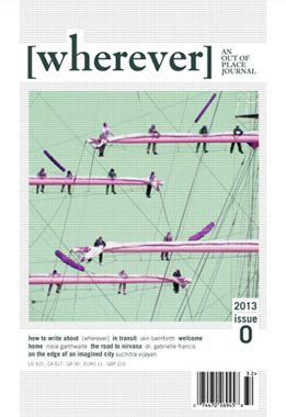
Taking a different approach from destination-heavy travel publications like Suitcase Magazine or Wallpaper* City Guides, newcomer [wherever] gets more literary; choosing to gather personal essays on experiences, cultures and politics, loosely tied together by the themes of travel and transience. Founder Rawan Hadid assembles a diverse group of contributors, telling us, “We’re looking for writing that tells the reader about a place, not a ‘destination’. The idea was to reflect the realities of travel outside the usual tropes and categories of ‘tourist’ or ‘business traveler’ and try to think of travel causes as more of a spectrum than a checkbox.”
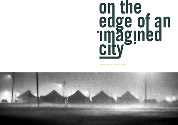
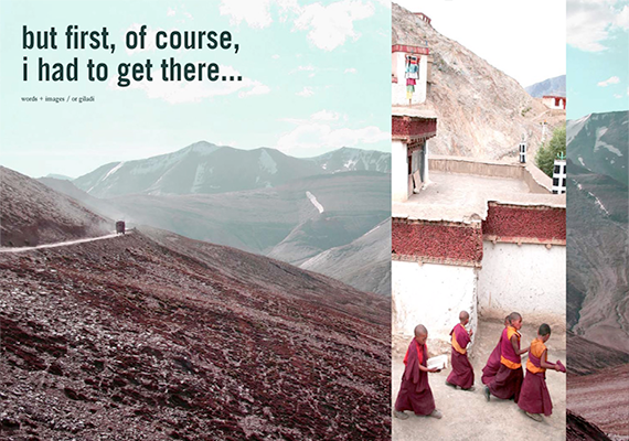
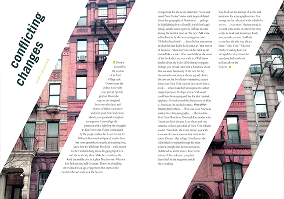
Ahmad diab pens “conflicting changes”, an essay about writing a new yorker. Rosie garthwaite follows hudson, a migrant worker living in doha home to sri lanka for his annual vacation and subsequently writes a guide to doha and colombo based on the trip. Iain bamforth’s “in transit” mediates on time, travel and mobility. Suchitra vijayan explores the maha kumbh mela through cartography: a city constructed to host a ritual bathing for millions of people in the ganges. A half-libyan writer pieces herself back together through her ancestry despite geographic distance and dr. gabrielle francis, a naturopath practising in new york, contributes a travelogue composed from her years of travels through india focused on spirituality and healing. Victor locuratolo contributes three [wherever] inspired illustrations steeped in his architectural practice.
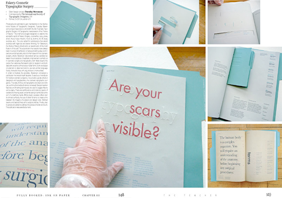
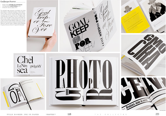
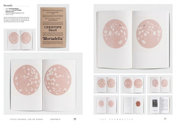
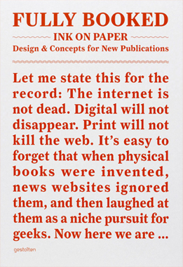
Fully Booked: Ink on Paper
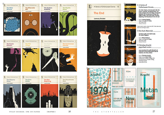
Digital media are disappointing for books. All books look the same on an iPad, for example. On a monitor, a book isn t thick or thin, big or small. Features such as a Japanese binding, embossing, letterpress printing, or gilt edging are only possible in print.
Consequently, it isn t surprising that young, contemporary designers, publishers, typographers, illustrators, and editors are enthusiastically ringing in a new era for printed books. Fully Booked: Ink on Paper is a collection of books and other printed products that celebrate the distinctiveness of design, materials, techniques, workmanship, and production methods and push their limits. Structured into five chapters that each represent a key role that print plays today: The Storyteller, The Showmaster, The Teacher, The Businessman, and The Collector, it showcases publications whose innovative printing and binding befit their unconventional subject matter or radical editorial and design concepts. Examples range from personal projects with the smallest print runs to premium artist books or brand publications. Fully Booked: Ink on Paper features work by groundbreaking designers and design studios such as A Practice for Everyday Life, Coralie Bickford-Smith, Heimann und Schwantes and Studio Laucke Siebein. Its stunning range of visual examples is put into context by texts from Andrew Losowsky, books editor at The Huffington Post. Fully Booked: Ink on Paper makes clear that the most exciting phase in the history of printed matter has just begun.
Red Bull Illume: Photography Competition
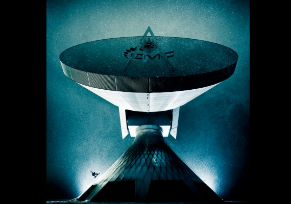
The quality of the images in the Top 50 was amazing, so for me it is a great honour to be voted number one. It’s so unreal. It will take a few days for the news to sink in, said Lorenz Holder, the Overall Winner of the 2013 Red Bull Illume.
“There are talented photographers and then there are gifted photographers,” said Jym Wilson, senior photo editor at USA Today and one of 50 Red Bull Illume judges. “I saw a lot of talent but also saw some truly gifted photographers. These are not just action photographers but people with great technical and artistic skills.
This high-quality coffee-table book presents the best images of the Red Bull Illume Image Quest 2013, the world’s biggest photo contest for action and adventure sports.
With its elegant design, the photobook shows the contest’s 250 semifinalists from all over the world and features select stories behind the shots as well as photographer biographies. With only 5,000 copies of the book available (each of them individually numbered), the limited-edition Red Bull Illume Photobook 2013 is a sophisticated collector’s item.
A part of the revenues of this Photobook sale are donated to the Wings for Life Fundation to support spinal cord research.


